The human eye can distinguish as many as
10 million different colors.
From fashion and beauty to furniture retail and tile manufacturing, the impact of color is immense. Businesses often hinge their identity and product appeal on precise shades and tones, ranging from standard colors like Azure and Ruby Red to unique hues like Fern, Charcoal, Byzantium, Celadon, and Smaragdine (yes, that’s a real color).
Some companies even venture into creating proprietary colors (the term ‘Tiffany Blue’ will always evoke imagery of that robin eggshell hue), underscoring how essential and influential color is to consumer preferences across diverse sectors.
The lesson is clear: getting color right is crucial and something businesses cannot afford to overlook.
Just as colors can be complex, the struggle for companies to manage them can be complex too. Across an entire enterprise, there could be multiple teams involved in managing color, from design and engineering to eCommerce and procurement. With multiple teams and users comes competing business objectives, a higher risk of human error, and lots of room for interpretation.
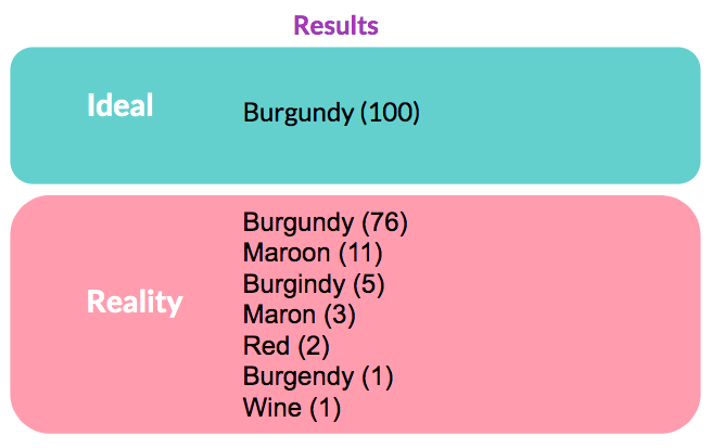
For 100 instances of 'Burgundy' in a product line, you could expect to get some variation of the following:
As you can see there are a lot of ways of interpreting (and spelling) the same thing. These types of discrepancies are a lot more common than many people realize. They certainly detract from the product experience your customers have, but they also cause problems with
Site Search and SEO, and can wreak havoc with attempts at applying analytics to products and buying trends.
Fortunately, these types of issues with colors are what
Product Information Management (PIM) systems were designed to eliminate.
Benefits of Streamlining Color Variations
Streamlining the color naming process for a business when listing their products across different marketplaces and geographic locations offers several benefits:
Consistent branding: Standardizing color names ensures that a brand is represented consistently no matter where its products are sold, aiding in maintaining a uniform brand identity and reinforcing brand recognition among consumers regardless of where they're shopping.
Improved customer experience: Consistent and clear color naming reduces confusion for customers, making it easier for them to find and select products, which can enhance customer satisfaction and potentially increase the likelihood of repeat purchases.
Enhanced searchability and SEO: Using standardized color names improves searchability across platforms. Customers often search for products by color, and consistent naming helps in aligning with common search terms, which can boost SEO and visibility.
Easier inventory and catalog management: When colors are named consistently, managing inventory across multiple channels becomes more straightforward. It simplifies tracking and reduces errors in stocking and distribution, leading to better inventory accuracy.
Streamlined communications: A standardized color naming system simplifies communication within the company and with external partners, such as manufacturers, distributors, suppliers, and retailers, reducing the risk of errors and miscommunications.
Cross-market appeal: Having a uniform color naming system helps in adapting and translating products for multiple markets without needing to customize the descriptions for each region too extensively, leading to more efficient expansions and launches in new markets.
Reduced costs: Streamlining the color naming process can lead to lower marketing and operational costs, and simplified product descriptions and catalogs mean less time and resources are spent on creating and managing product listings across various platforms.
Improved data analytics and reporting: Standardized color names make it easier to collect and analyze data on color trends and preferences across different markets. This can inform future product development and marketing strategies, allowing businesses to be more responsive to consumer needs.
By adopting a streamlined approach to color naming, businesses can enhance their operational efficiency and market adaptability, leading to better customer engagement and potentially higher sales.
Akeneo PIM & The Color Conundrum
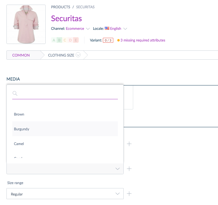
In Akeneo PIM, this headache would be solved by creating a field (attribute) of the simple or multi-select type. These fields allow the business to decide on exactly how they want to present each color (is it 'Burgundy' or is it 'Maroon'?) and then enforce governance for all of their users so that they are applied consistently.
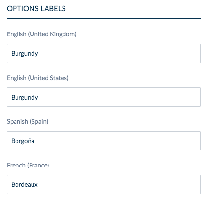
Just as important in today’s global markets, the translation of these colors can also be standardized. Here’s what this approach looks like in Akeneo PIM:
Another common problem with managing color is that an individual color may need several different iterations depending on what system or team is working with it. For example, it’s not uncommon for a new SKU to be onboarded by a purchasing manager who inputs it as a generic “Blue” to fit the basic (and boring) requirements of the ERP system. Next, this same color is recreated as “Sapphire” by a content specialist looking to provide a proper marketing name. And on yet another path along the color carousel could involve an eCommerce Manager accounting for a website filter or search engine and going with 'Navy Blue'.
In Akeneo PIM, users could account for this by making separate attributes like ERP Color, Color, SEO Tags, or Site Color. This allows you to manage the unique requirements of each component of color with data governance in the same product record. Or, you could utilize
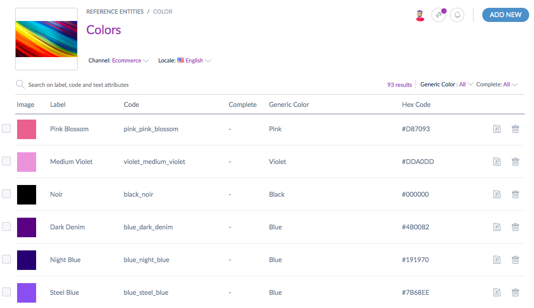
Reference Entities, which help you to maintain all of colors and color variations in a single centralized entity as shown below:
Reference Entities also allow you to store and manage additional color information like Hex Codes and Swatches. All of this information can also be adapted and translated to different Sales Channels and Locales.
Finally, (and arguably this is where the real power lies!) if I want to change a color’s name or description information,
Reference Entities allow me to update ALL of the products referenced to that record in a few clicks without having to update each record individually.
Managing colors is a complex and important part of product information management that is a struggle for companies of all sizes. High quality images may present what a product looks like to consumers, but it’s not enough. To optimize website filters, SEO, internal operations, and the tastes of discerning consumers who expect an exceptional product experience, color must be correct and contextualized across languages and business applications. Don’t whitewash color as I used to by treating it as just another data point to be managed in a back-end system. Instead, treat color like Picasso or Van Gogh did: as a powerful tool of great depth and intricacy that can attract attention and help curate the customer’s experience.


 Akeneo Product Cloud
 Summer Release